No One Cares About Your Logo
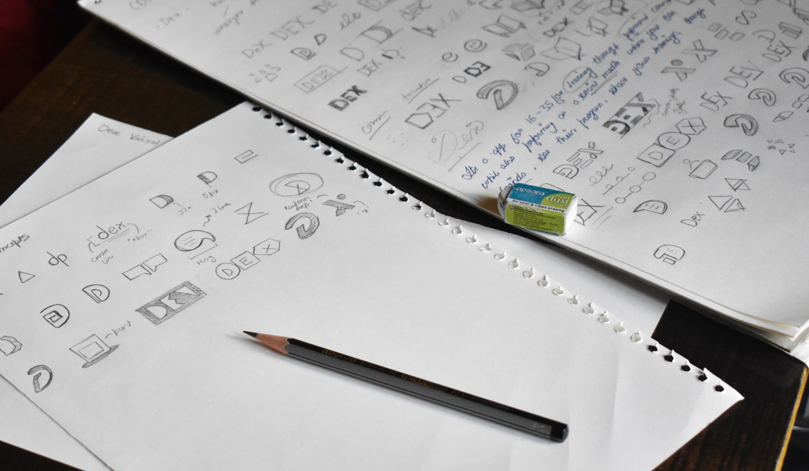
I have worked in design in some form for almost 20 years now. I have worked as an employee, as a freelancer, as a contractor, and directly with a lot of independent clients, customers, companies, and creators. Over those years, I have designed more logos and brand identity sets than I can realistically keep track of.
And after all of that, there is one piece of advice I would give to almost any business owner who is getting a logo designed, starting a new business, or trying to rethink their brand.
No one cares about your logo as much as you do.
That probably sounds strange coming from someone who has spent so much time designing logos. I care about typography. I care about spacing. I care about color palettes, proportions, alignment, visual consistency, and all of the little details that make a piece of design feel polished and professional. I believe good design matters. I believe a strong visual identity matters.
But I also think a lot of businesses dramatically overestimate what a logo can actually do for them.
A logo is not what makes a brand good. The business behind the logo is what eventually gives the logo meaning.
Your Logo Is Not the Thing People Care About First
One of the biggest mistakes I see businesses make is trying to pack their logo into everything.
If there is an empty spot on a brochure, they want to put the logo there. If there is some open space on the website, they want to put the logo there. If the logo is already in the navigation, they want to make it bigger. If they are designing shirts, mugs, napkins, menus, ads, folders, or any other piece of branded material, the default instinct is often the same: put the logo on it.
I understand why this happens. When you are building a business, the logo feels important because it represents the thing you are trying to build. It feels official. It feels like the visual symbol of all the work, stress, planning, risk, and hope that went into starting the company.
But your customer does not experience it that way.
Your customer does not see your logo and automatically think your business must be good. They do not see your logo and suddenly trust you. They do not see your logo and decide your restaurant has great food, your software is useful, your course is worth taking, or your service is worth paying for.
They believe those things after you give them a reason to believe them.
The logo can become a shortcut for trust later, but it does not create that trust by itself.
Famous Logos Became Famous Because of the Business Behind Them
I think part of the confusion comes from the way people look at famous brands.
They see the Nike swoosh, the Apple logo, the McDonald’s arches, the Amazon smile, or the Walmart spark, and they assume the logo is what made the company memorable. But that is backwards.
The Nike swoosh did not make Nike great. Nike made the swoosh meaningful.
That mark only matters because of the products, the athletes, the campaigns, the stores, the shoes, and the decades of experiences people associate with Nike. Without all of that, the swoosh is just a shape.
The same is true with Apple. The Apple logo means something because of the products and experiences people associate with it. The logo is not the source of the meaning. It is the container for the meaning.
That is the part a lot of businesses get wrong. They look at the end result of a recognizable brand and think the logo created the recognition. In reality, the recognition came from years of delivering something people wanted, and the logo became the symbol attached to that experience.
Your logo does not make people care about your business. Your business gives people a reason to care, and then the logo gives them a way to remember it.
A Good Logo Cannot Save a Bad Experience
A restaurant is probably the easiest example.
If you run a restaurant and the food is amazing, the service is great, the space feels good, and people enjoy being there, your logo can be incredibly simple. It could almost be a red square with a name next to it, and people would still remember you because the experience was good.
But if the food is terrible, the service is rude, the prices feel unreasonable, and the entire experience is frustrating, putting your logo on every napkin, plate, coffee cup, receipt, menu, and wall is not going to fix anything.
It will just help people remember the bad experience.
That is the part business owners need to be honest about. A logo is not a substitute for a good product. A brand identity is not a substitute for good service. A beautiful color palette is not a substitute for giving people something they actually want.
Design matters, but it cannot carry a mediocre business.
If the thing behind the logo is good, the logo can become meaningful over time. If the thing behind the logo is bad, the logo just becomes the visual reminder of something people did not like.
Creators Usually Do Not Need a Logo at All
This is especially true for creators.
If you are a creator, your name and your face are usually your logo. You do not need to spend months trying to invent a clever icon, mascot, monogram, or mark before you start publishing, teaching, selling, writing, recording, or building.
If you have something useful to say, say it. If you have something valuable to teach, teach it. If you have something interesting to make, make it.
A beautiful logo will not rescue boring content. A clever mark will not make people care if the work behind it does not help them, entertain them, challenge them, or solve a problem for them.
For my own site, my logo is basically just my signature. I also use a little pirate-style galleon because I like it and because it ties into an old phrase I have used for years: “Let’s build your digital flagship.”
But I do not pretend someone is going to see that little ship and instantly decide I am a great designer or developer. It is a design element. I like it. It adds a bit of personality. That is all it needs to do.
The actual trust has to come from the work, the writing, the tools, the content, the products, and the experience people have when they interact with what I make.
White Space Is Not an Invitation to Add More Stuff
The obsession with logos is usually part of a bigger design problem: clutter.
One of the hardest parts of being a designer is convincing people not to add more things to a design. Most people will say they like simplicity. They will say they want something clean, modern, elegant, readable, and professional. Then the moment they see open space, the instinct kicks in.
Can we put the phone number there? Can we add the address? Can we make the logo bigger? Can we add the website again? Can we put another badge in that corner? Can we fill that empty space?
But empty space is not wasted space.
In many cases, the space is what makes the design feel good. It gives the important parts room to stand out. It makes the whole thing easier to read. It gives the viewer a chance to understand what they are looking at without being visually attacked by a dozen competing elements.
Good design is often not about what else you can add. It is about what you can take away.
I think a lot of businesses are afraid to leave anything out because they imagine they might miss one possible customer. But today, people have more ways than ever to find you. They do not need to see your phone number printed 28 times. They do not need your logo in every corner. They do not need every available detail crammed into every available inch.
If they are interested, they will search your name. They will find your website. They will ask Google, ChatGPT, Gemini, Claude, or whatever else they use to find out where you are, what you do, and how to contact you.
That does not mean you should hide important information. It means you should stop assuming that more information always makes the design better.
Most of the time, it makes it worse.
Your Customer Is Not Studying Your Brand Guidelines
As business owners, designers, and creators, we spend a lot of time thinking about things most customers barely notice.
We think about the logo, the font pairing, the spacing, the exact shade of blue, the size of the mark, the placement of every element, and whether everything lines up with the brand guidelines.
Some of that matters. I am not arguing against consistency. A clean visual identity can make your business feel more trustworthy, more polished, and more professional. It can make your materials feel connected. It can make your business easier to recognize over time.
But your customer is usually not thinking about any of that first.
They are asking much simpler questions.
Can this business help me? Do I trust them? Do they understand what I need? Is this worth my time? What do I do next?
If your design helps answer those questions, it is doing its job. If your design gets in the way because you are trying to show off the brand instead of serving the customer, it is not doing its job.
This is where logo placement can become self-serving. It turns into a way of saying, “Look at us. Look at our brand. Look at how official we are.”
But the customer is not there to admire how official you feel. They are there because they have a problem, a desire, a question, a need, or a goal.
The design should serve that first.
Consistency Matters, But It Comes Second
To be clear, I am not saying logos are pointless.
A good logo is useful. A clean visual identity is useful. Consistent typography, colors, spacing, and layout are useful. They help create recognition. They make your business feel more intentional. They give your materials a sense of continuity.
That matters.
But it still comes second.
Your logo should support the business, not become the business. Your identity should create clarity, not clutter. Your design should make the customer’s path easier, not give you more places to stamp your own name.
The better question is not, “Where can we put the logo?”
The better question is, “What would make this more useful for the customer?”
Sometimes the answer might involve the logo. Most of the time, it probably will not.
It might be a clearer headline. It might be a stronger offer. It might be better photography. It might be fewer words. It might be a simpler layout. It might be a more obvious call to action. It might be removing half the things you wanted to add.
That is the discipline of good design. Not decorating every surface. Not filling every gap. Not making the brand louder for the sake of being louder.
Good design helps people understand what matters.
Build Something Worth Remembering
The goal is not to make people remember your logo.
The goal is to build something worth remembering.
If your food is great, people will remember the restaurant. If your service is excellent, people will remember the business. If your course helps someone make real progress, they will remember the teacher. If your website helps someone understand, trust, and take action, they will remember the experience.
Your logo can become part of that memory, but it does not create the memory by itself.
So yes, get a good logo. Make it clean. Make it professional. Make sure it works in the places it needs to work.
Then stop obsessing over it.
Put that energy into the product, the service, the content, the offer, the customer experience, and the actual thing people came to you for.
Because no one cares about your logo as much as you do.
They care about whether the business behind it is any good.